


.mh-pdp { max-width: 860px; margin: 0 auto; font-family: -apple-system, BlinkMacSystemFont, “Segoe UI”, Helvetica, Arial, sans-serif; padding: 28px 22px 12px; line-height: 1.6; font-size: 15px; –brand-dark: #3E2723; –brand-bg: #F6F5EF; –brand-light: #949494; –brand-white: #FFFFFF; –brand-border: #DDDDDD; –bg: var(–brand-bg); –bg-card: var(–brand-white); –bg-warm: #EDE9DB; –bg-softer: #ECEAE0; –border: #E2DFD4; –border-lt: #EDEAE0; –accent-dk: #2A1A17; –accent-tint: #EDE6DC; –accent-bdr: #D4C9B8; –text: var(–brand-dark); –text-mid: #6B5D5A; –text-light: var(–brand-light); color: var(–text); background: transparent; } .mh-pdp * { box-sizing: border-box; font-size: 15px !important; } .mh-pdp svg { fill: none !important; } .mh-pdp a { text-decoration: none; color: inherit; } .mh-pdp img { max-width: 100%; height: auto; display: block; } .mh-pdp p { margin: 0 0 0.8rem; color: var(–text-mid); } .mh-pdp section { margin-bottom: 2.6rem; } .mh-pdp .sec-header { display: flex; align-items: center; gap: 14px; margin-bottom: 1.3rem; } .mh-pdp .sec-header-line { flex: 1; height: 0.5px; background: var(–border); } .mh-pdp .sec-title { font-weight: 400; color: var(–brand-dark); white-space: nowrap; } /* Tag chips (in overview) */ .mh-pdp .tag-row { display: flex; flex-wrap: wrap; gap: 6px; margin: 0 0 1.1rem; } .mh-pdp .tag { font-weight: 500; color: var(–brand-dark); background: var(–accent-tint); border: 0.5px solid var(–accent-bdr); padding: 3px 11px; border-radius: 99px; letter-spacing: 0.01em; } /* Video embed */ .mh-pdp .video-embed { position: relative; padding-bottom: 56.25%; height: 0; border-radius: 12px; overflow: hidden; border: 0.5px solid var(–border); } .mh-pdp .video-embed iframe { position: absolute; top: 0; left: 0; width: 100%; height: 100%; display: block; } /* Dark finish bar */ .mh-pdp .finish-bar { background: var(–accent-dk); border-radius: 10px; padding: 18px 22px; display: flex; align-items: center; justify-content: space-between; gap: 18px; flex-wrap: wrap; margin-top: 1.4rem; } .mh-pdp .finish-bar-text { color: #c5bcac; line-height: 1.55; } .mh-pdp .finish-bar-text strong { color: #f0e8d8; font-weight: 600; display: block; letter-spacing: 0.02em; margin-bottom: 3px; text-transform: uppercase; } .mh-pdp .finish-bar-chips { display: flex; gap: 16px; flex-wrap: wrap; } .mh-pdp .bar-chip { display: flex; align-items: center; gap: 8px; color: #e8e0c8; letter-spacing: 0.01em; } .mh-pdp .bar-chip-dot { width: 16px; height: 16px; border-radius: 50%; border: 0.5px solid rgba(255,255,255,0.18); flex-shrink: 0; } /* Note card */ .mh-pdp .note-card { display: flex; gap: 12px; align-items: flex-start; padding: 15px 17px; margin-top: 1.2rem; background: var(–bg-warm); border: 0.5px solid var(–accent-bdr); border-left: 2.5px solid var(–brand-dark); border-radius: 8px; } .mh-pdp .note-card svg { width: 20px; height: 20px; flex-shrink: 0; margin-top: 1px; stroke: var(–brand-dark); stroke-width: 1.6; } .mh-pdp .note-card p { margin: 0; color: var(–text-mid); line-height: 1.6; } .mh-pdp .note-card strong { color: var(–brand-dark); font-weight: 600; } /* Shade comparison */ .mh-pdp .shade-compare { display: grid; grid-template-columns: 1fr 1fr; gap: 12px; margin-top: 1.2rem; } .mh-pdp .shade-card { background: var(–bg-card); border: 0.5px solid var(–border); border-radius: 12px; padding: 22px 20px; } .mh-pdp .shade-card-head { display: flex; align-items: center; justify-content: space-between; gap: 10px; margin-bottom: 10px; } .mh-pdp .shade-card-title { font-weight: 600; color: var(–brand-dark); letter-spacing: 0.01em; } .mh-pdp .shade-card-pill { font-weight: 600; color: var(–brand-dark); background: var(–bg-warm); border: 0.5px solid var(–accent-bdr); padding: 2px 10px; border-radius: 99px; letter-spacing: 0.02em; text-transform: uppercase; font-size: 12px !important; } .mh-pdp .shade-card-desc { color: var(–text-mid); line-height: 1.55; margin: 0; } .mh-pdp .shade-image-wrap { border-radius: 10px; overflow: hidden; border: 0.5px solid var(–border); margin-top: 1.2rem; } /* Features */ .mh-pdp .features-grid { display: grid; grid-template-columns: repeat(3, 1fr); gap: 10px; } .mh-pdp .feature-card { background: var(–bg-card); border: 0.5px solid var(–border); border-radius: 10px; padding: 22px 18px 20px; display: flex; flex-direction: column; } .mh-pdp .feature-icon-wrap { width: 40px; height: 40px; border-radius: 50%; background: var(–bg-warm); border: 0.5px solid var(–accent-bdr); display: flex; align-items: center; justify-content: center; margin: 0 auto 14px; } .mh-pdp .feature-icon-wrap svg { width: 18px; height: 18px; stroke: var(–brand-dark); stroke-width: 1.6; } .mh-pdp .feature-title { font-size: 15px !important; font-family: inherit !important; font-weight: 600 !important; color: var(–brand-dark) !important; text-transform: none !important; letter-spacing: -0.005em !important; line-height: 1.3 !important; margin: 0 0 8px !important; text-align: center !important; display: flex !important; align-items: center !important; justify-content: center !important; min-height: 2.6em; } .mh-pdp .feature-desc { color: var(–text-mid); line-height: 1.55; margin: 0; text-align: center; } /* Length options card */ .mh-pdp .length-card { background: var(–bg-card); border: 0.5px solid var(–border); border-radius: 12px; padding: 26px 26px 22px; text-align: center; } .mh-pdp .length-card-label { font-weight: 600; color: var(–text-light); letter-spacing: 0.08em; text-transform: uppercase; margin-bottom: 14px; font-size: 13px !important; } .mh-pdp .length-row { display: flex; justify-content: center; align-items: stretch; gap: 0; flex-wrap: wrap; } .mh-pdp .length-pill { padding: 10px 22px; border: 0.5px solid var(–border); background: var(–bg-warm); font-weight: 600; color: var(–brand-dark); font-variant-numeric: tabular-nums; letter-spacing: 0.01em; white-space: nowrap; } .mh-pdp .length-pill:first-child { border-radius: 8px 0 0 8px; } .mh-pdp .length-pill:last-child { border-radius: 0 8px 8px 0; } .mh-pdp .length-pill + .length-pill { border-left: 0; } .mh-pdp .length-sub { margin-top: 12px; color: var(–text-mid); font-size: 13px !important; letter-spacing: 0.01em; } /* Dimensions detail block */ .mh-pdp .dim-detail { background: var(–bg-card); border: 0.5px solid var(–border); border-radius: 12px; padding: 22px 24px; margin-top: 12px; } .mh-pdp .dim-detail-row { display: flex; justify-content: space-between; align-items: baseline; gap: 16px; padding: 10px 0; border-bottom: 0.5px solid var(–border-lt); } .mh-pdp .dim-detail-row:last-child { border-bottom: 0; } .mh-pdp .dim-detail-key { color: var(–text-mid); letter-spacing: 0.01em; } .mh-pdp .dim-detail-val { font-weight: 600; color: var(–brand-dark); font-variant-numeric: tabular-nums; text-align: right; } /* Spec grid */ .mh-pdp .spec-grid { display: flex; flex-direction: column; border: 0.5px solid var(–border); border-radius: 12px; overflow: hidden; background: var(–bg-card); } .mh-pdp .spec-item { padding: 14px 18px; border-bottom: 0.5px solid var(–border-lt); display: flex; align-items: center; gap: 16px; } .mh-pdp .spec-item:nth-child(even) { background: var(–bg-softer); } .mh-pdp .spec-item:last-child { border-bottom: 0; } .mh-pdp .spec-key { font-weight: 700; letter-spacing: 0.04em; text-transform: uppercase; color: var(–brand-dark); width: 180px; flex-shrink: 0; } .mh-pdp .spec-val { font-weight: 500; color: var(–text); } .mh-pdp .spec-val-dot { display: inline-flex; align-items: center; gap: 7px; margin-right: 16px; } .mh-pdp .spec-val-dot span.dot { width: 14px; height: 14px; border-radius: 50%; border: 0.5px solid rgba(62,39,35,0.12); flex-shrink: 0; display: inline-block; } /* Cert badges */ .mh-pdp .cert-badges-grid { display: inline-grid; grid-template-columns: repeat(2, auto); gap: 6px 6px; } .mh-pdp .cert-badge { font-weight: 500; color: var(–brand-dark); background: var(–accent-tint); border: 0.5px solid var(–accent-bdr); padding: 3px 11px; border-radius: 99px; text-align: center; white-space: nowrap; } /* Downloads */ .mh-pdp .dl-grid { display: grid; grid-template-columns: repeat(3, 1fr); gap: 10px; } .mh-pdp .dl-btn { display: flex; flex-direction: column; align-items: center; justify-content: center; gap: 10px; padding: 22px 14px; border-radius: 10px; border: 0.5px solid var(–border); background: var(–bg-card); text-decoration: none; color: var(–brand-dark); font-weight: 600; text-align: center; transition: border-color 0.2s ease, background 0.2s ease; } .mh-pdp .dl-btn:hover { border-color: var(–brand-dark); background: var(–bg-warm); } .mh-pdp .dl-icon-wrap { width: 42px; height: 42px; border-radius: 50%; background: var(–bg-warm); border: 0.5px solid var(–accent-bdr); display: flex; align-items: center; justify-content: center; } .mh-pdp .dl-icon-wrap svg { width: 19px; height: 19px; stroke: var(–brand-dark); stroke-width: 1.6; fill: none !important; } .mh-pdp .dl-title { line-height: 1.3; letter-spacing: 0.01em; } .mh-pdp .dl-sub { font-weight: 600; color: var(–text-light); letter-spacing: 0.02em; text-transform: uppercase; margin-top: -2px; } /* FAQ */ .mh-pdp .faq-list { display: flex; flex-direction: column; gap: 8px; } .mh-pdp .faq-list details { background: var(–bg-card); border: 0.5px solid var(–border); border-radius: 10px; overflow: hidden; transition: border-color 0.2s ease; } .mh-pdp .faq-list details[open] { border-color: var(–accent-bdr); } .mh-pdp .faq-list summary { cursor: pointer; list-style: none; padding: 16px 18px; font-weight: 600; color: var(–brand-dark); display: flex; align-items: center; justify-content: space-between; gap: 14px; } .mh-pdp .faq-list summary::-webkit-details-marker { display: none; } .mh-pdp .faq-list summary::after { content: ”; width: 22px; height: 22px; border-radius: 50%; background: var(–bg-warm) url(“data:image/svg+xml,%3Csvg xmlns=’http://www.w3.org/2000/svg’ viewBox=’0 0 12 12’%3E%3Cpath d=’M3 4.5l3 3 3-3′ stroke=’%233E2723′ stroke-width=’1.6′ fill=’none’ stroke-linecap=’round’ stroke-linejoin=’round’/%3E%3C/svg%3E”) center/10px no-repeat; border: 0.5px solid var(–accent-bdr); flex-shrink: 0; transition: transform 0.25s ease; } .mh-pdp .faq-list details[open] summary::after { transform: rotate(180deg); } .mh-pdp .faq-a { padding: 0 18px 16px; color: var(–text-mid); line-height: 1.65; } /* Responsive */ @media (max-width: 600px) { .mh-pdp { padding: 22px 16px 10px; } .mh-pdp .features-grid { grid-template-columns: 1fr; } .mh-pdp .feature-title { min-height: 0; } .mh-pdp .dl-grid { grid-template-columns: 1fr; } .mh-pdp .shade-compare { grid-template-columns: 1fr; } .mh-pdp .spec-key { width: 130px; letter-spacing: 0.03em; } .mh-pdp .spec-item { padding: 12px 14px; gap: 10px; } .mh-pdp .length-pill { padding: 9px 14px; } .mh-pdp .finish-bar { padding: 16px 18px; } .mh-pdp .cert-badges-grid { grid-template-columns: 1fr; } .mh-pdp .dim-detail-row { flex-direction: column; gap: 2px; padding: 8px 0; } .mh-pdp .dim-detail-val { text-align: left; } }
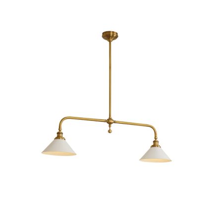
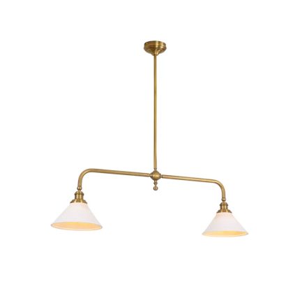
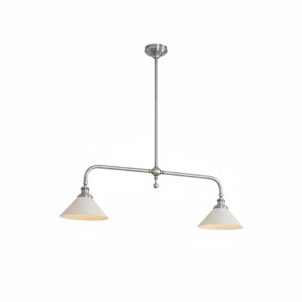
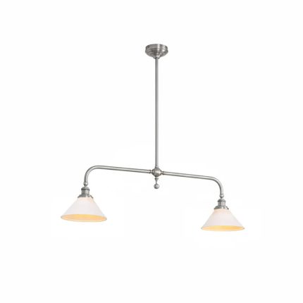
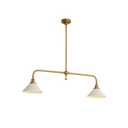
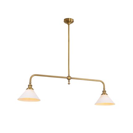
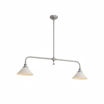
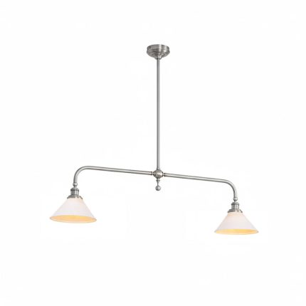
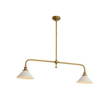
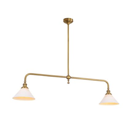
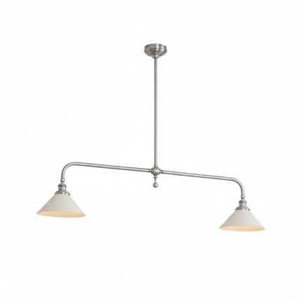
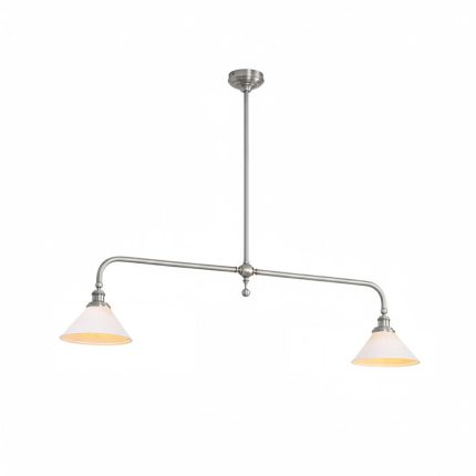
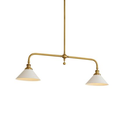
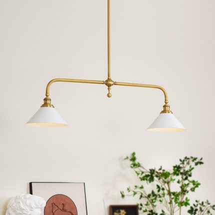
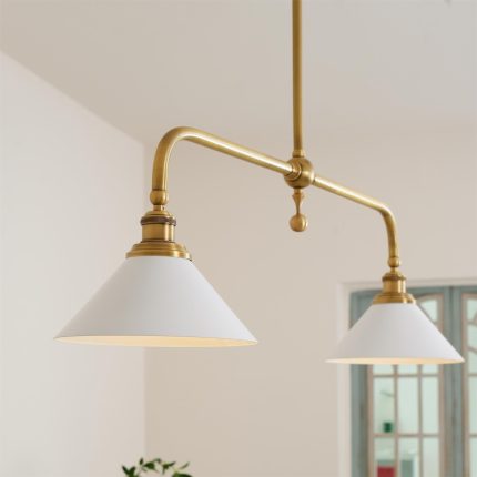
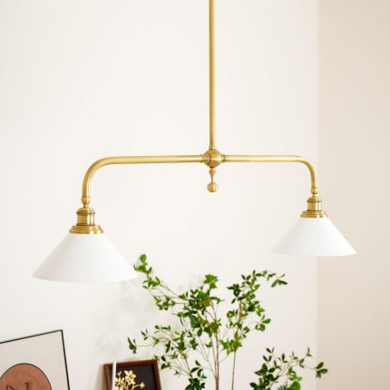
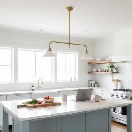
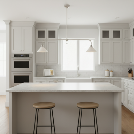
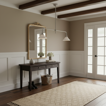
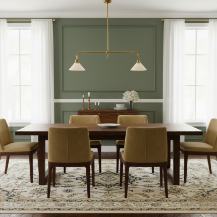
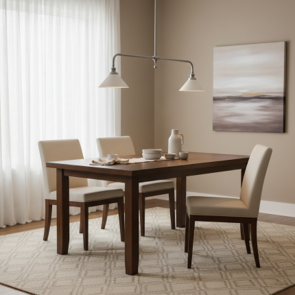
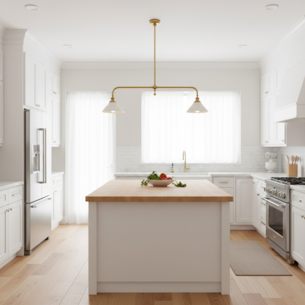
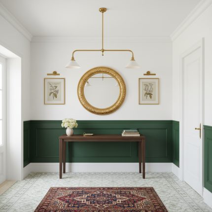
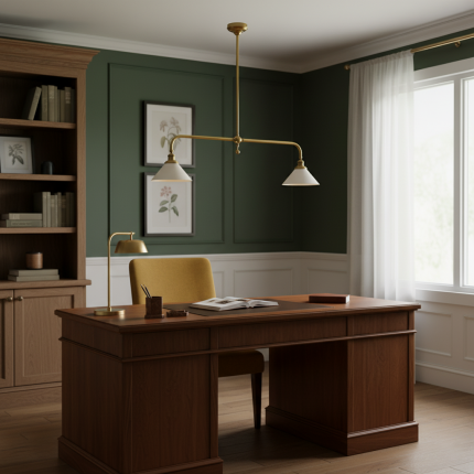
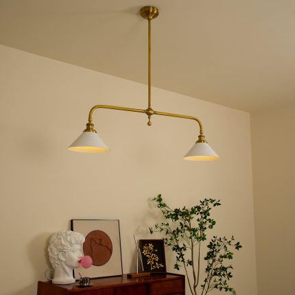
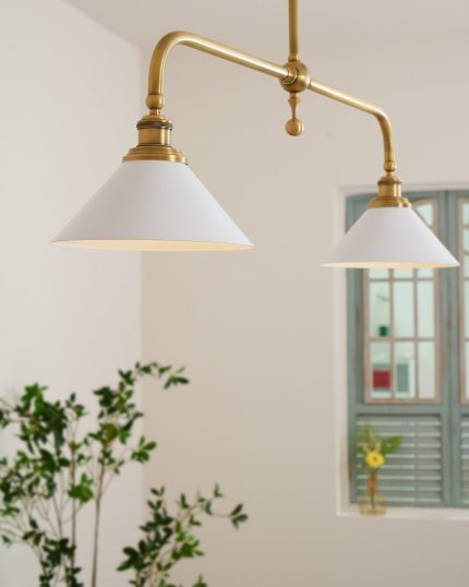
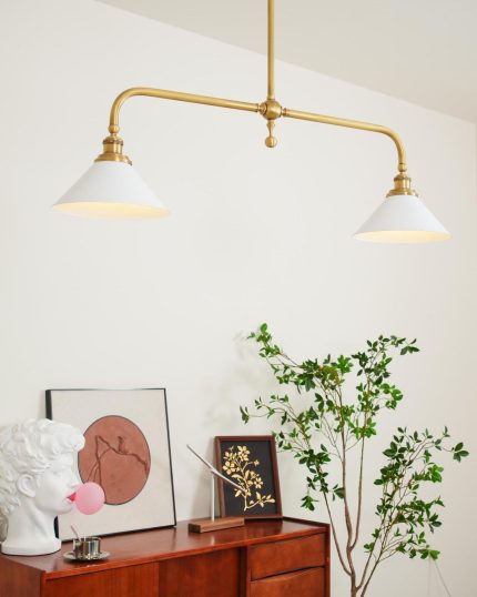
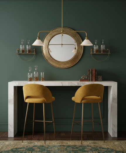
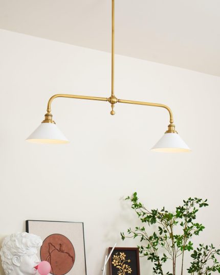
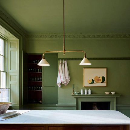
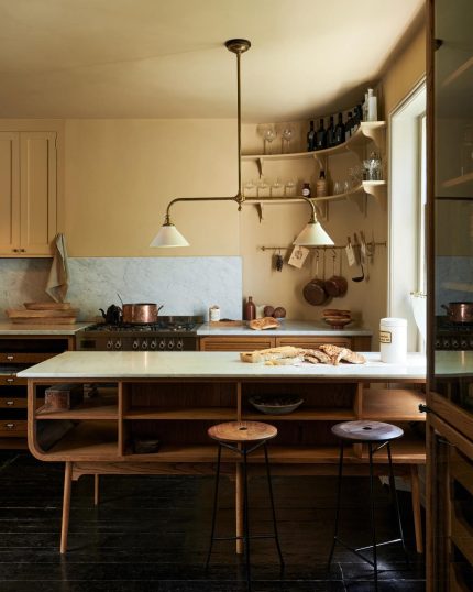
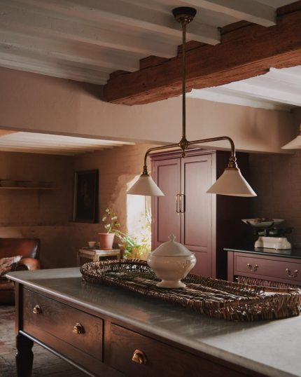
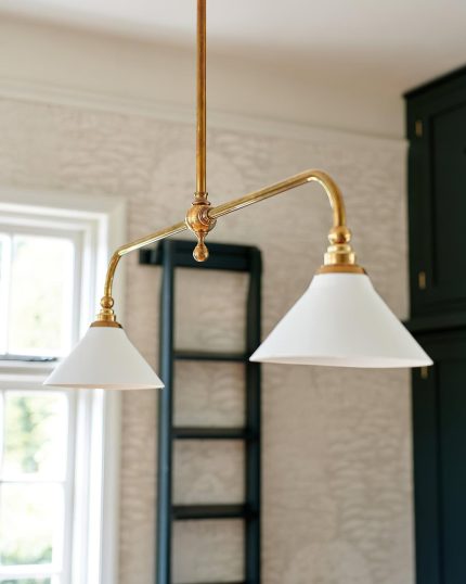
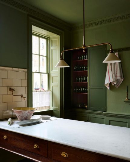
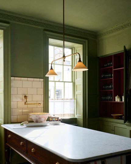
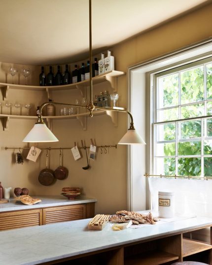
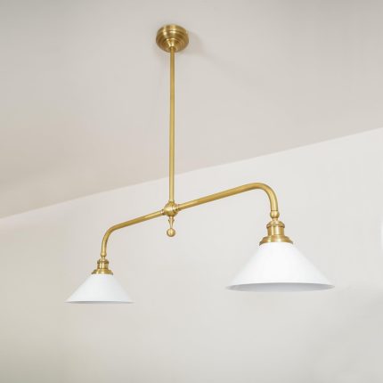
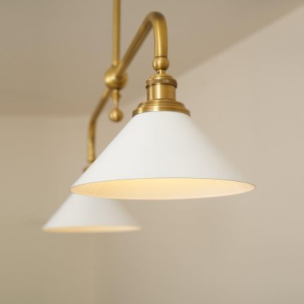
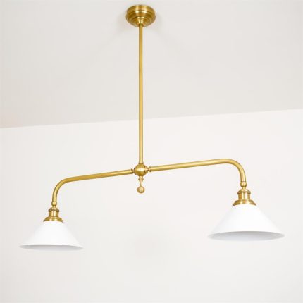
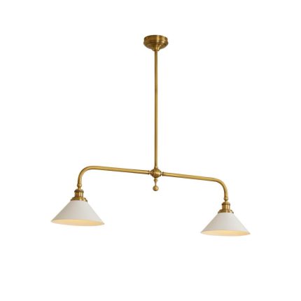
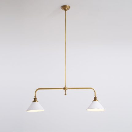
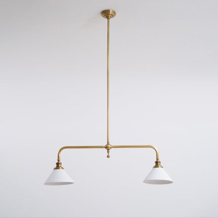
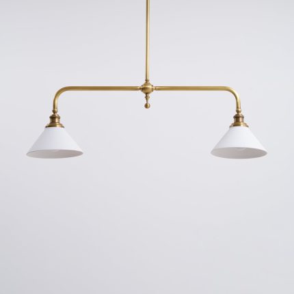
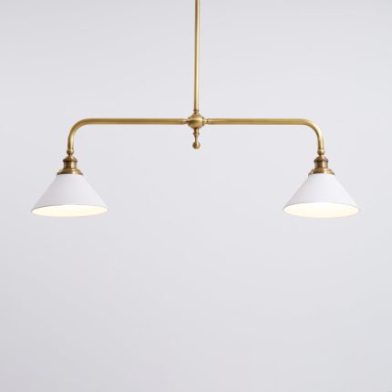
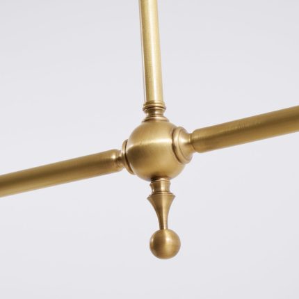
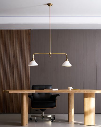
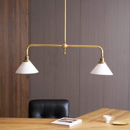
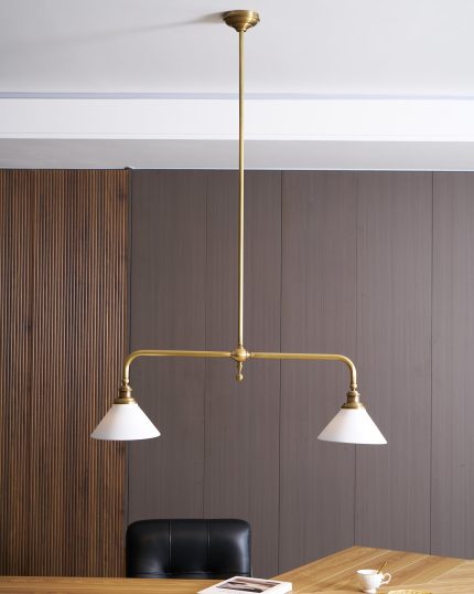
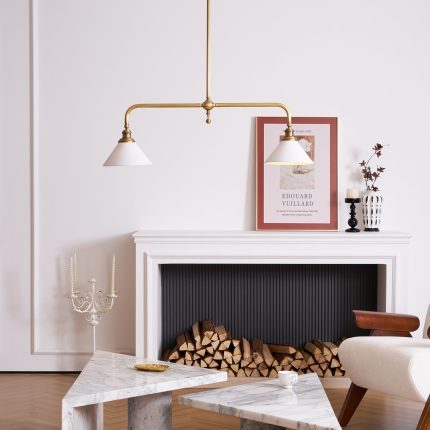
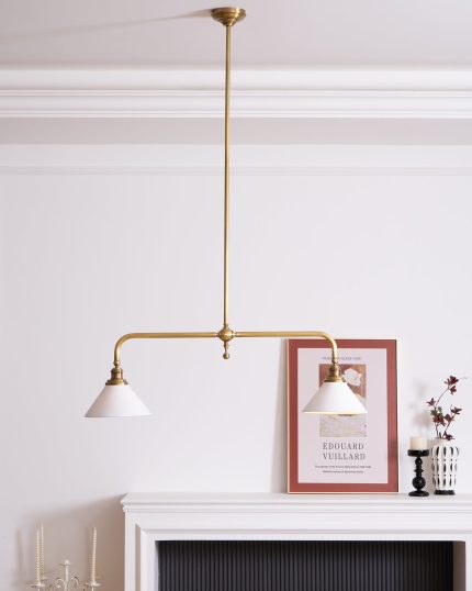
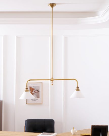
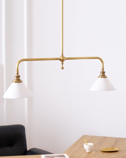
Heirloom is a linear pendant built around quiet refinement — a slender aged-brass body suspending two diffused shades along a single horizontal line. The result is a long, low wash of light that frames a kitchen island or dining table without crowding the space above it.
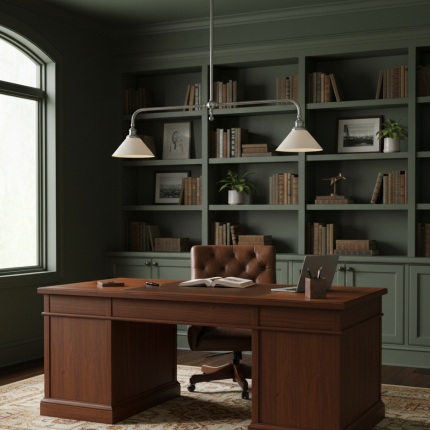
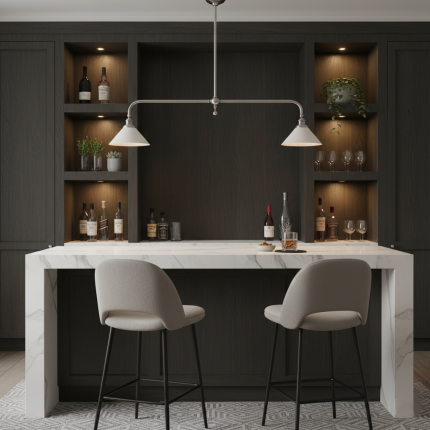
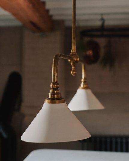
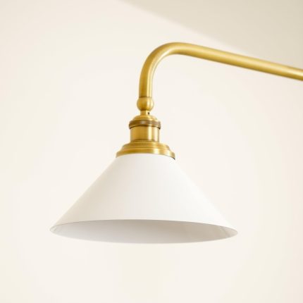
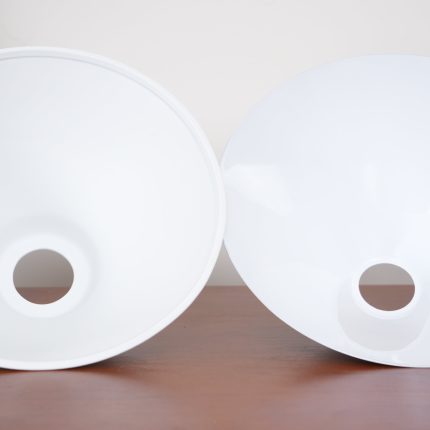
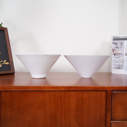
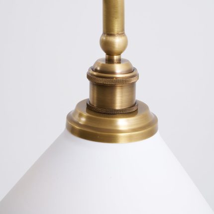
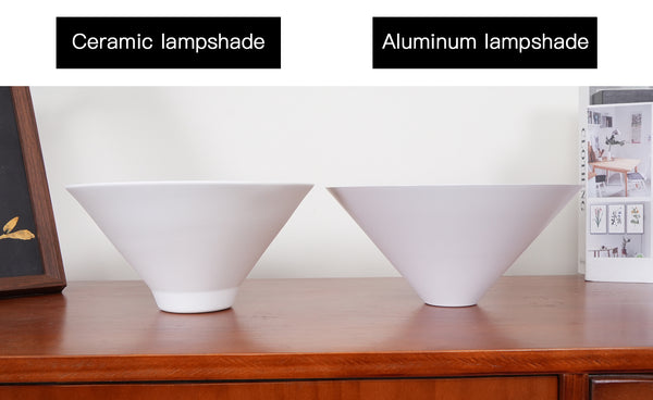
Choose between two distinct shade materials to match the mood of your room: a translucent ceramic shade that glows with a soft, lantern-like warmth, or a spun aluminum shade that throws focused, downward task light onto the surface below. Either way, the brass canopy and ceiling cup keep the installation looking deliberate and architectural.
Two diffusers along an aged-brass horizontal bar — sized to wash an entire dining table or island in even, glare-free light.
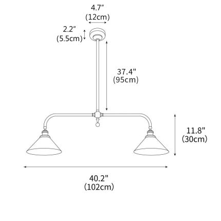
102, 120, or 140 cm — match the fixture span to your table or island for proportional, designer-grade scale.
Three modular rod sections (29.5″ + 11.8″ + 7.9″) let you tune ceiling drop to vaulted, standard, or low-profile rooms.
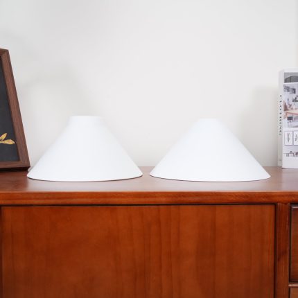
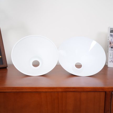
Heirloom is offered in two shade materials. Each gives the lamp a different character and a different quality of light — pick the one that matches how you’ll use the room beneath it.
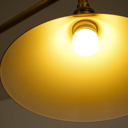
Glazed ceramic gently transmits light through the shade itself, producing a soft, ambient glow that fills the whole room — ideal for dining tables where mood matters as much as function.
Spun aluminum directs light downward in a clean, focused beam — perfect for kitchen islands and prep counters. Lighter, more shock-resistant, and safer to ship than ceramic.
What length should I choose for my dining table or island?
Ceramic shade or aluminum shade — which should I pick?
Are bulbs included? What type do I need?
How adjustable is the hanging height?
Is professional installation required?
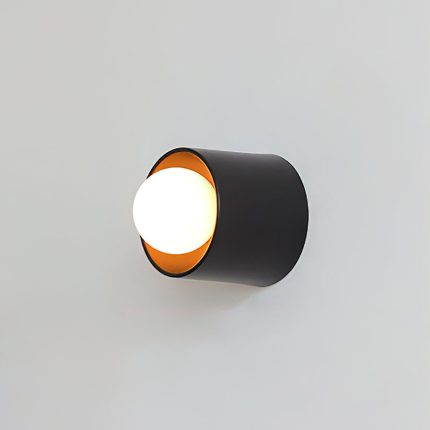
Cylora Tube Wall Sconce
Price range: $125.00 through $285.00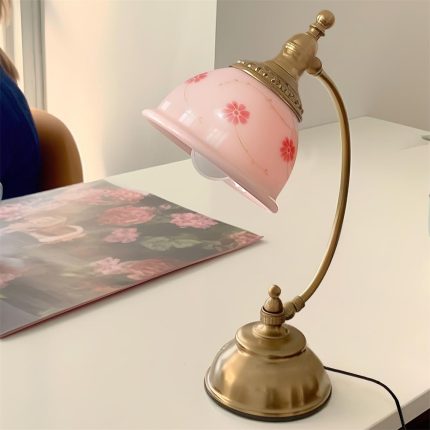
Mishya Floral Table Lamp
$174.00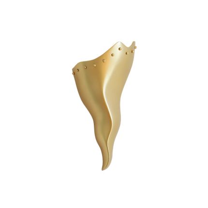
Valyra Wall Sconce
$225.00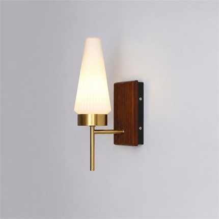
Taviren Wall Sconce
Original price was: $300.00.$154.00Current price is: $154.00.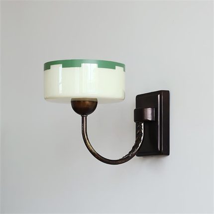
Elvaris Wall Sconce
Original price was: $300.00.$156.00Current price is: $156.00.
Reviews
There are no reviews yet.