


.mh-pdp { max-width: 860px; margin: 0 auto; font-family: -apple-system, BlinkMacSystemFont, “Segoe UI”, Helvetica, Arial, sans-serif; padding: 28px 22px 12px; line-height: 1.6; font-size: 15px; –brand-dark: #3E2723; –brand-bg: #F6F5EF; –brand-light: #949494; –brand-white: #FFFFFF; –brand-border: #DDDDDD; –bg: var(–brand-bg); –bg-card: var(–brand-white); –bg-warm: #EDE9DB; –bg-softer: #ECEAE0; –border: #E2DFD4; –border-lt: #EDEAE0; –accent-dk: #2A1A17; –accent-tint: #EDE6DC; –accent-bdr: #D4C9B8; –text: var(–brand-dark); –text-mid: #6B5D5A; –text-light: var(–brand-light); color: var(–text); background: transparent; } .mh-pdp * { box-sizing: border-box; font-size: 15px !important; } .mh-pdp svg { fill: none !important; } .mh-pdp a { text-decoration: none; color: inherit; } .mh-pdp img { max-width: 100%; height: auto; display: block; } .mh-pdp p { margin: 0 0 0.8rem; color: var(–text-mid); } .mh-pdp section { margin-bottom: 2.6rem; } .mh-pdp .sec-header { display: flex; align-items: center; gap: 14px; margin-bottom: 1.3rem; } .mh-pdp .sec-header-line { flex: 1; height: 0.5px; background: var(–border); } .mh-pdp .sec-title { font-weight: 400; color: var(–brand-dark); white-space: nowrap; } /* Tag chips */ .mh-pdp .tag-row { display: flex; flex-wrap: wrap; gap: 6px; margin: 0 0 1.1rem; } .mh-pdp .tag { font-weight: 500; color: var(–brand-dark); background: var(–accent-tint); border: 0.5px solid var(–accent-bdr); padding: 3px 11px; border-radius: 99px; letter-spacing: 0.01em; } /* Video embed */ .mh-pdp .video-embed { position: relative; padding-bottom: 56.25%; height: 0; border-radius: 12px; overflow: hidden; border: 0.5px solid var(–border); } .mh-pdp .video-embed + .video-embed { margin-top: 12px; } .mh-pdp .video-embed iframe { position: absolute; top: 0; left: 0; width: 100%; height: 100%; display: block; } /* Dark finish bar */ .mh-pdp .finish-bar { background: var(–accent-dk); border-radius: 10px; padding: 18px 22px; display: flex; align-items: center; justify-content: space-between; gap: 18px; flex-wrap: wrap; margin-top: 1.4rem; } .mh-pdp .finish-bar-text { color: #c5bcac; line-height: 1.55; } .mh-pdp .finish-bar-text strong { color: #f0e8d8; font-weight: 600; display: block; letter-spacing: 0.02em; margin-bottom: 3px; text-transform: uppercase; } .mh-pdp .finish-bar-chips { display: flex; gap: 16px; flex-wrap: wrap; } .mh-pdp .bar-chip { display: flex; align-items: center; gap: 8px; color: #e8e0c8; letter-spacing: 0.01em; } .mh-pdp .bar-chip-dot { width: 16px; height: 16px; border-radius: 50%; border: 0.5px solid rgba(255,255,255,0.18); flex-shrink: 0; } /* Note card */ .mh-pdp .note-card { display: flex; gap: 12px; align-items: flex-start; padding: 15px 17px; margin-top: 1.2rem; background: var(–bg-warm); border: 0.5px solid var(–accent-bdr); border-left: 2.5px solid var(–brand-dark); border-radius: 8px; } .mh-pdp .note-card svg { width: 20px; height: 20px; flex-shrink: 0; margin-top: 1px; stroke: var(–brand-dark); stroke-width: 1.6; } .mh-pdp .note-card p { margin: 0; color: var(–text-mid); line-height: 1.6; } .mh-pdp .note-card strong { color: var(–brand-dark); font-weight: 600; } /* Shade comparison */ .mh-pdp .shade-compare { display: grid; grid-template-columns: 1fr 1fr; gap: 12px; margin-top: 1.2rem; } /* Size compare — 3-col variant of shade-compare for this product */ .mh-pdp .size-compare { display: grid; grid-template-columns: repeat(3, 1fr); gap: 12px; margin-top: 1.2rem; } .mh-pdp .shade-card { background: var(–bg-card); border: 0.5px solid var(–border); border-radius: 12px; padding: 22px 20px; } .mh-pdp .shade-card-head { display: flex; align-items: center; justify-content: space-between; gap: 10px; margin-bottom: 10px; } .mh-pdp .shade-card-title { font-weight: 600; color: var(–brand-dark); letter-spacing: 0.01em; } .mh-pdp .shade-card-pill { font-weight: 600; color: var(–brand-dark); background: var(–bg-warm); border: 0.5px solid var(–accent-bdr); padding: 2px 10px; border-radius: 99px; letter-spacing: 0.02em; text-transform: uppercase; font-size: 12px !important; } .mh-pdp .shade-card-desc { color: var(–text-mid); line-height: 1.55; margin: 0; } .mh-pdp .shade-card-dims { margin-top: 10px; padding-top: 10px; border-top: 0.5px solid var(–border-lt); font-variant-numeric: tabular-nums; color: var(–brand-dark); font-weight: 600; letter-spacing: 0.01em; } .mh-pdp .shade-card-dims small { display: block; font-size: 13px !important; color: var(–text-mid); font-weight: 500; margin-top: 2px; letter-spacing: 0; } .mh-pdp .shade-image-wrap { border-radius: 10px; overflow: hidden; border: 0.5px solid var(–border); margin-top: 1.2rem; } /* Features */ .mh-pdp .features-grid { display: grid; grid-template-columns: repeat(3, 1fr); gap: 10px; } .mh-pdp .feature-card { background: var(–bg-card); border: 0.5px solid var(–border); border-radius: 10px; padding: 22px 18px 20px; display: flex; flex-direction: column; } .mh-pdp .feature-icon-wrap { width: 40px; height: 40px; border-radius: 50%; background: var(–bg-warm); border: 0.5px solid var(–accent-bdr); display: flex; align-items: center; justify-content: center; margin: 0 auto 14px; } .mh-pdp .feature-icon-wrap svg { width: 18px; height: 18px; stroke: var(–brand-dark); stroke-width: 1.6; } .mh-pdp .feature-title { font-size: 15px !important; font-family: inherit !important; font-weight: 600 !important; color: var(–brand-dark) !important; text-transform: none !important; letter-spacing: -0.005em !important; line-height: 1.3 !important; margin: 0 0 8px !important; text-align: center !important; display: flex !important; align-items: center !important; justify-content: center !important; min-height: 2.6em; } .mh-pdp .feature-desc { color: var(–text-mid); line-height: 1.55; margin: 0; text-align: center; } /* Length / size options card */ .mh-pdp .length-card { background: var(–bg-card); border: 0.5px solid var(–border); border-radius: 12px; padding: 26px 26px 22px; text-align: center; } .mh-pdp .length-card-label { font-weight: 600; color: var(–text-light); letter-spacing: 0.08em; text-transform: uppercase; margin-bottom: 14px; font-size: 13px !important; } .mh-pdp .length-row { display: flex; justify-content: center; align-items: stretch; gap: 0; flex-wrap: wrap; } .mh-pdp .length-pill { padding: 10px 22px; border: 0.5px solid var(–border); background: var(–bg-warm); font-weight: 600; color: var(–brand-dark); font-variant-numeric: tabular-nums; letter-spacing: 0.01em; white-space: nowrap; } .mh-pdp .length-pill:first-child { border-radius: 8px 0 0 8px; } .mh-pdp .length-pill:last-child { border-radius: 0 8px 8px 0; } .mh-pdp .length-pill + .length-pill { border-left: 0; } .mh-pdp .length-sub { margin-top: 12px; color: var(–text-mid); font-size: 13px !important; letter-spacing: 0.01em; } /* Dimensions detail block */ .mh-pdp .dim-detail { background: var(–bg-card); border: 0.5px solid var(–border); border-radius: 12px; padding: 22px 24px; margin-top: 12px; } .mh-pdp .dim-detail-row { display: flex; justify-content: space-between; align-items: baseline; gap: 16px; padding: 10px 0; border-bottom: 0.5px solid var(–border-lt); } .mh-pdp .dim-detail-row:last-child { border-bottom: 0; } .mh-pdp .dim-detail-key { color: var(–text-mid); letter-spacing: 0.01em; } .mh-pdp .dim-detail-val { font-weight: 600; color: var(–brand-dark); font-variant-numeric: tabular-nums; text-align: right; } /* Spec grid */ .mh-pdp .spec-grid { display: flex; flex-direction: column; border: 0.5px solid var(–border); border-radius: 12px; overflow: hidden; background: var(–bg-card); } .mh-pdp .spec-item { padding: 14px 18px; border-bottom: 0.5px solid var(–border-lt); display: flex; align-items: center; gap: 16px; } .mh-pdp .spec-item:nth-child(even) { background: var(–bg-softer); } .mh-pdp .spec-item:last-child { border-bottom: 0; } .mh-pdp .spec-key { font-weight: 700; letter-spacing: 0.04em; text-transform: uppercase; color: var(–brand-dark); width: 180px; flex-shrink: 0; } .mh-pdp .spec-val { font-weight: 500; color: var(–text); } .mh-pdp .spec-val-dot { display: inline-flex; align-items: center; gap: 7px; margin-right: 16px; } .mh-pdp .spec-val-dot span.dot { width: 14px; height: 14px; border-radius: 50%; border: 0.5px solid rgba(62,39,35,0.12); flex-shrink: 0; display: inline-block; } /* Cert badges */ .mh-pdp .cert-badges-grid { display: inline-grid; grid-template-columns: repeat(2, auto); gap: 6px 6px; } .mh-pdp .cert-badge { font-weight: 500; color: var(–brand-dark); background: var(–accent-tint); border: 0.5px solid var(–accent-bdr); padding: 3px 11px; border-radius: 99px; text-align: center; white-space: nowrap; } /* Downloads */ .mh-pdp .dl-grid { display: grid; grid-template-columns: repeat(3, 1fr); gap: 10px; } .mh-pdp .dl-btn { display: flex; flex-direction: column; align-items: center; justify-content: center; gap: 10px; padding: 22px 14px; border-radius: 10px; border: 0.5px solid var(–border); background: var(–bg-card); text-decoration: none; color: var(–brand-dark); font-weight: 600; text-align: center; transition: border-color 0.2s ease, background 0.2s ease; } .mh-pdp .dl-btn:hover { border-color: var(–brand-dark); background: var(–bg-warm); } .mh-pdp .dl-icon-wrap { width: 42px; height: 42px; border-radius: 50%; background: var(–bg-warm); border: 0.5px solid var(–accent-bdr); display: flex; align-items: center; justify-content: center; } .mh-pdp .dl-icon-wrap svg { width: 19px; height: 19px; stroke: var(–brand-dark); stroke-width: 1.6; fill: none !important; } .mh-pdp .dl-title { line-height: 1.3; letter-spacing: 0.01em; } .mh-pdp .dl-sub { font-weight: 600; color: var(–text-light); letter-spacing: 0.02em; text-transform: uppercase; margin-top: -2px; } /* FAQ */ .mh-pdp .faq-list { display: flex; flex-direction: column; gap: 8px; } .mh-pdp .faq-list details { background: var(–bg-card); border: 0.5px solid var(–border); border-radius: 10px; overflow: hidden; transition: border-color 0.2s ease; } .mh-pdp .faq-list details[open] { border-color: var(–accent-bdr); } .mh-pdp .faq-list summary { cursor: pointer; list-style: none; padding: 16px 18px; font-weight: 600; color: var(–brand-dark); display: flex; align-items: center; justify-content: space-between; gap: 14px; } .mh-pdp .faq-list summary::-webkit-details-marker { display: none; } .mh-pdp .faq-list summary::after { content: ”; width: 22px; height: 22px; border-radius: 50%; background: var(–bg-warm) url(“data:image/svg+xml,%3Csvg xmlns=’http://www.w3.org/2000/svg’ viewBox=’0 0 12 12’%3E%3Cpath d=’M3 4.5l3 3 3-3′ stroke=’%233E2723′ stroke-width=’1.6′ fill=’none’ stroke-linecap=’round’ stroke-linejoin=’round’/%3E%3C/svg%3E”) center/10px no-repeat; border: 0.5px solid var(–accent-bdr); flex-shrink: 0; transition: transform 0.25s ease; } .mh-pdp .faq-list details[open] summary::after { transform: rotate(180deg); } .mh-pdp .faq-a { padding: 0 18px 16px; color: var(–text-mid); line-height: 1.65; } /* Video trigger (install video popup) */ .mh-pdp .video-trigger { display: flex; align-items: center; gap: 14px; padding: 16px 18px; margin-top: 12px; background: var(–bg-card); border: 0.5px solid var(–accent-bdr); border-left: 2.5px solid var(–brand-dark); border-radius: 10px; text-decoration: none !important; color: var(–brand-dark) !important; cursor: pointer; transition: background 0.2s ease, border-color 0.2s ease; } .mh-pdp .video-trigger:link, .mh-pdp .video-trigger:visited { color: var(–brand-dark) !important; } .mh-pdp .video-trigger:hover { background: var(–bg-warm); border-color: var(–brand-dark); } .mh-pdp .video-trigger-icon { width: 40px; height: 40px; flex-shrink: 0; border-radius: 50%; background: var(–accent-dk); display: flex; align-items: center; justify-content: center; } .mh-pdp .video-trigger-icon svg { width: 14px; height: 14px; fill: #f0e8d8 !important; stroke: none; margin-left: 2px; } .mh-pdp .video-trigger-text { flex: 1; line-height: 1.4; } .mh-pdp .video-trigger-title { display: block; font-weight: 600; color: var(–brand-dark); margin-bottom: 2px; } .mh-pdp .video-trigger-sub { display: block; color: var(–text-mid); font-size: 13px !important; letter-spacing: 0.01em; } .mh-pdp .video-trigger-arrow { color: var(–text-mid); flex-shrink: 0; display: flex; } .mh-pdp .video-trigger-arrow svg { stroke: currentColor; fill: none !important; } /* Video modal (in-site popup, checkbox-hack toggle, fully no-JS) */ .mh-modal-toggle { position: fixed !important; /* fixed (not absolute) so focusing it doesn’t scroll the page */ top: 0 !important; left: 0 !important; width: 1px !important; height: 1px !important; padding: 0 !important; margin: 0 !important; overflow: hidden !important; clip: rect(0,0,0,0) !important; white-space: nowrap !important; border: 0 !important; opacity: 0 !important; pointer-events: none !important; } .mh-pdp-modal { position: fixed; inset: 0; z-index: 99999; display: none; align-items: center; justify-content: center; padding: 24px; } .mh-modal-toggle:checked ~ .mh-pdp-modal { display: flex !important; } .mh-pdp-modal-backdrop { position: absolute; inset: 0; background: rgba(20, 14, 12, 0.85); -webkit-backdrop-filter: blur(4px); backdrop-filter: blur(4px); cursor: pointer; display: block; margin: 0; } .mh-pdp-modal-content { position: relative; z-index: 1; width: 100%; max-width: 960px; background: #000; border-radius: 12px; overflow: hidden; box-shadow: 0 30px 80px rgba(0,0,0,0.5); } .mh-pdp-modal-frame { position: relative; width: 100%; aspect-ratio: 16 / 9; } .mh-pdp-modal-frame > *, .mh-pdp-modal-frame iframe { position: absolute !important; top: 0 !important; left: 0 !important; width: 100% !important; height: 100% !important; padding: 0 !important; margin: 0 !important; border: 0 !important; } .mh-pdp-modal-close { position: absolute; top: 12px; right: 12px; width: 40px; height: 40px; border-radius: 50%; background: rgba(0, 0, 0, 0.6); -webkit-backdrop-filter: blur(8px); backdrop-filter: blur(8px); cursor: pointer; display: flex !important; align-items: center; justify-content: center; z-index: 10; font-family: inherit; padding: 0; margin: 0; border: 0; transition: background 0.2s ease, transform 0.2s ease; } .mh-pdp-modal-close:hover { background: rgba(255, 255, 255, 0.22); transform: scale(1.05); } .mh-pdp-modal-close svg { width: 16px; height: 16px; stroke: #fff !important; stroke-width: 2; fill: none !important; display: block; } /* Responsive */ @media (max-width: 600px) { .mh-pdp { padding: 22px 16px 10px; } .mh-pdp .features-grid { grid-template-columns: 1fr; } .mh-pdp .feature-title { min-height: 0; } .mh-pdp .dl-grid { grid-template-columns: 1fr; } .mh-pdp .shade-compare, .mh-pdp .size-compare { grid-template-columns: 1fr; } .mh-pdp .spec-key { width: 130px; letter-spacing: 0.03em; } .mh-pdp .spec-item { padding: 12px 14px; gap: 10px; } .mh-pdp .length-pill { padding: 9px 14px; } .mh-pdp .finish-bar { padding: 16px 18px; } .mh-pdp .cert-badges-grid { grid-template-columns: 1fr; } .mh-pdp .dim-detail-row { flex-direction: column; gap: 2px; padding: 8px 0; } .mh-pdp .dim-detail-val { text-align: left; } .mh-pdp .video-trigger { padding: 14px 14px; gap: 12px; } .mh-pdp .video-trigger-icon { width: 36px; height: 36px; } .mh-pdp-modal { padding: 12px; } .mh-pdp-modal-close { top: 8px; right: 8px; width: 36px; height: 36px; } }
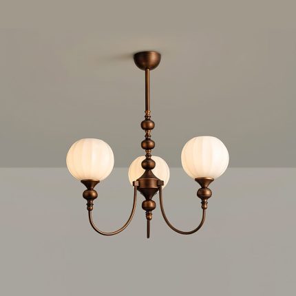
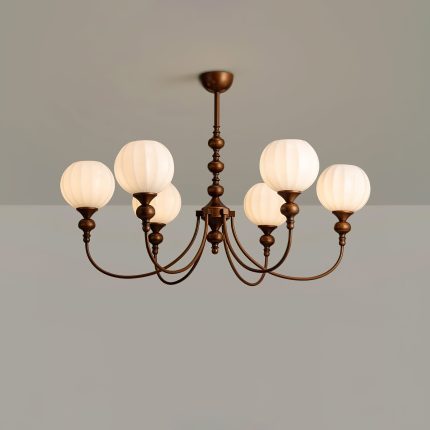
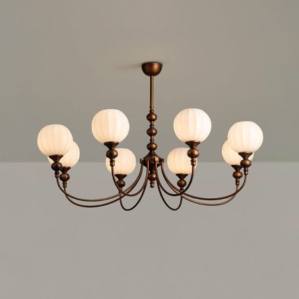
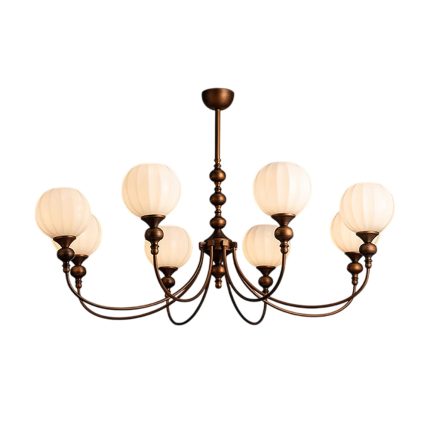
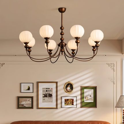
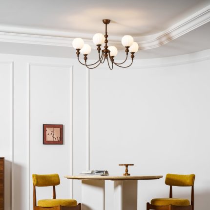
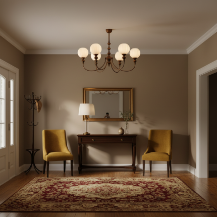
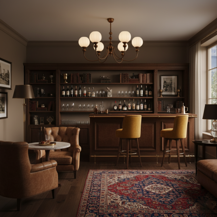
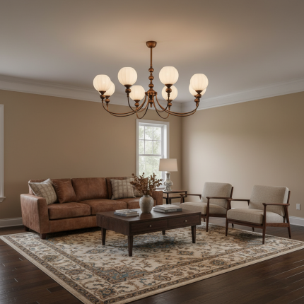
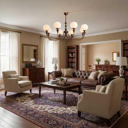
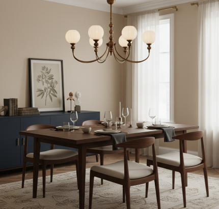
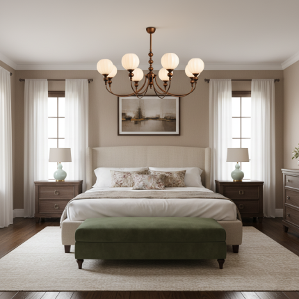
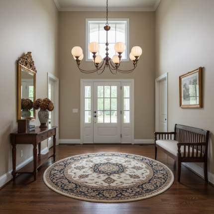
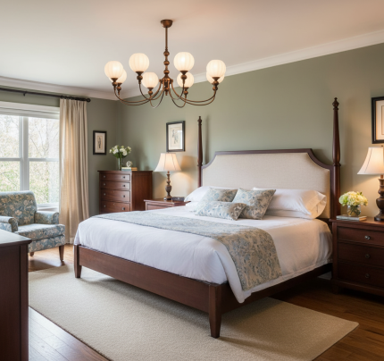
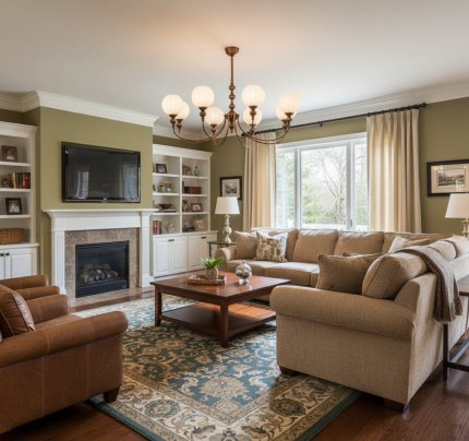
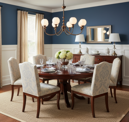
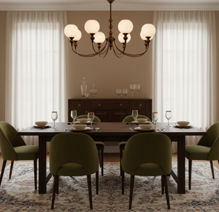
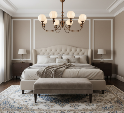
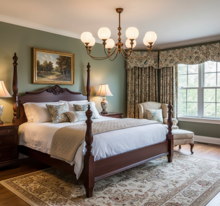
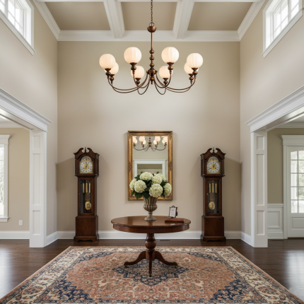
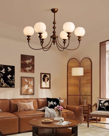
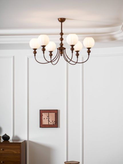
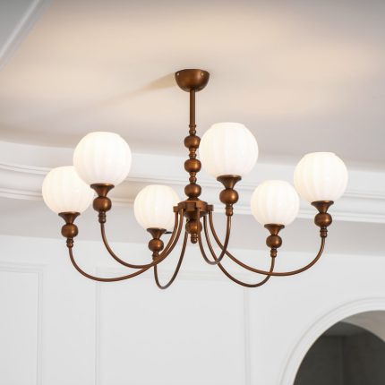
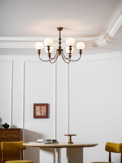
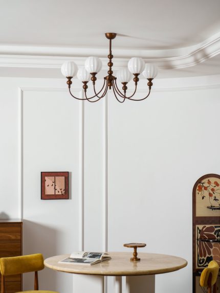
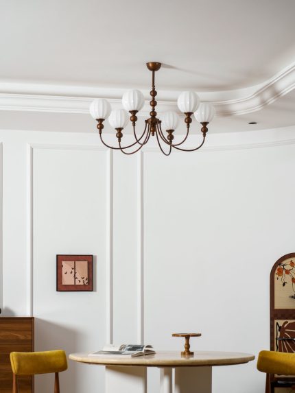
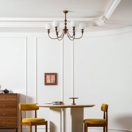
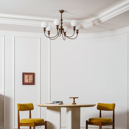
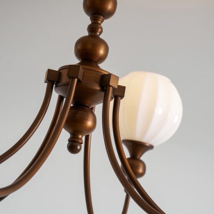
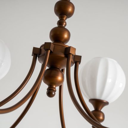
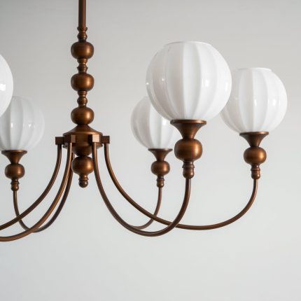
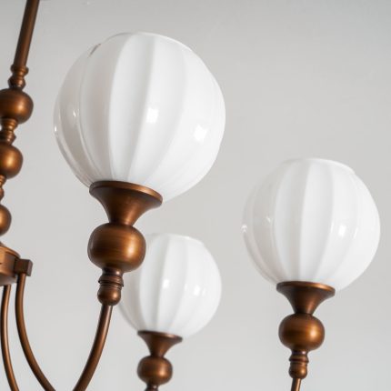
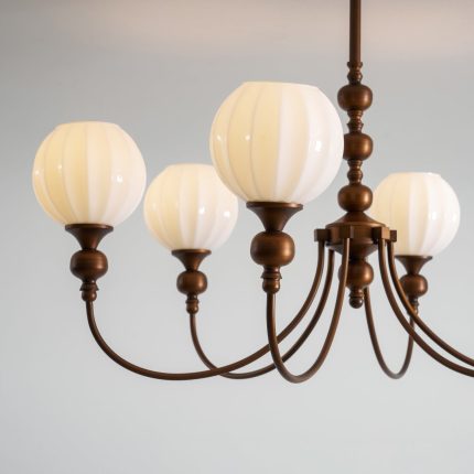
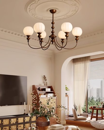
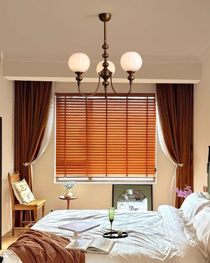
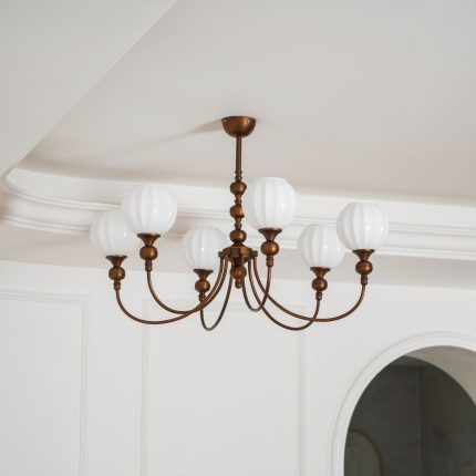
The Retro Monique Chandelier brings refined vintage charm to any interior. Gracefully curved iron arms support softly ribbed glass globes, evoking the elegance of old-world craftsmanship while delivering warm, ambient light.
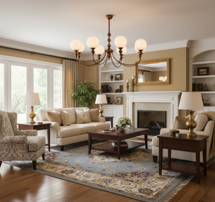
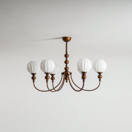
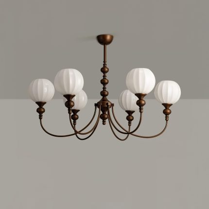
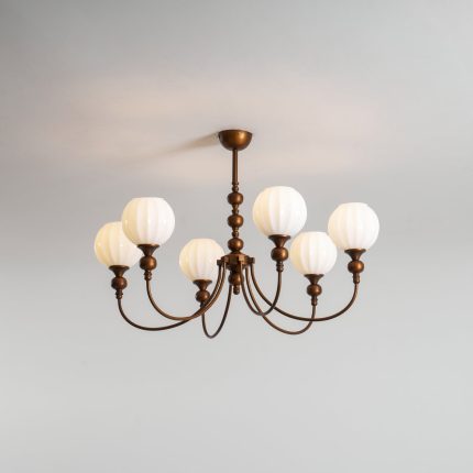
Available in three sizes — 3, 6, or 8 heads — Monique scales from an intimate entryway statement to a generous dining-room centerpiece. Equally at home in farmhouse, transitional, and eclectic interiors.
Softly fluted glass diffusers cast a warm, lantern-like glow that fills the room without harsh glare.
Choose 3, 6, or 8 heads — fit a cozy entry, a six-seat dining table, or an open great room without losing proportion.
Curved iron arms in a vintage bronze finish — built with the weight and presence of old-world craftsmanship.
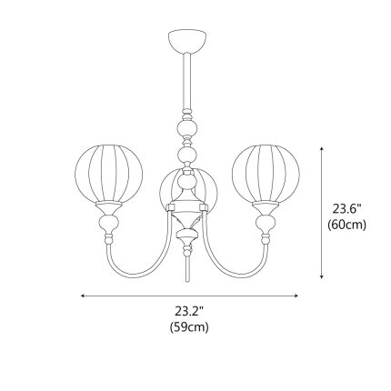
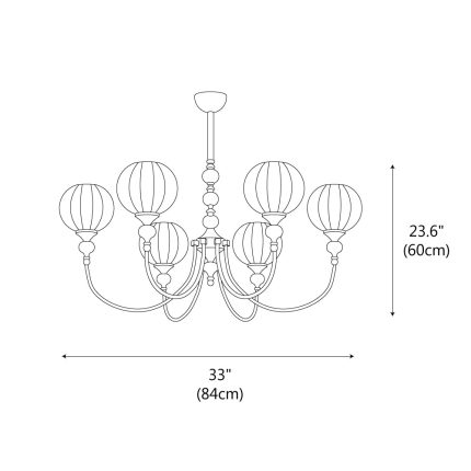
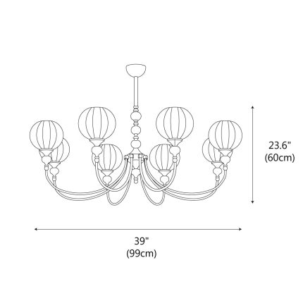
Monique is offered in three sizes — pick the one that matches the room and the surface beneath it. The diagram further down shows all three variants drawn to scale.
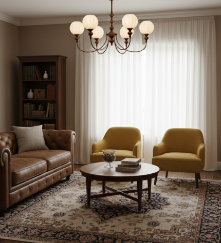
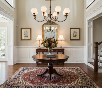
Best for entryways, breakfast nooks, and smaller dining tables up to ~150 cm / 60″.
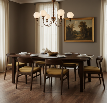
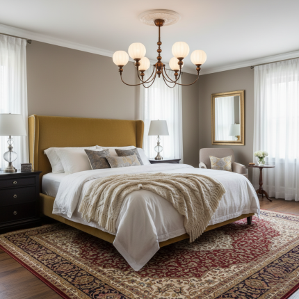
A versatile centerpiece for standard dining tables (~180 cm / 70″) or generous living-room ceilings.
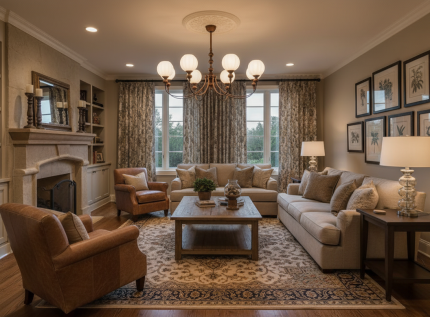
A grand fixture for long dining tables (200 cm / 78″+), open-plan great rooms, and double-height entries.

Click the image above to enlarge. All three sizes share the same 60 cm overall height and 50 cm (19.7″) suspension rod — only diameter and head count change.
6 Heads: D 33″ × H 23.6″ / D 84 cm × H 60 cm
8 Heads: D 39″ × H 23.6″ / D 99 cm × H 60 cm
Which size should I choose for my dining room or living room?
Are bulbs included? What type do I need?
How high should the chandelier hang above a dining table?
Is professional installation required?
Can I install Monique on a sloped or vaulted ceiling?
Where is Monique certified for use?
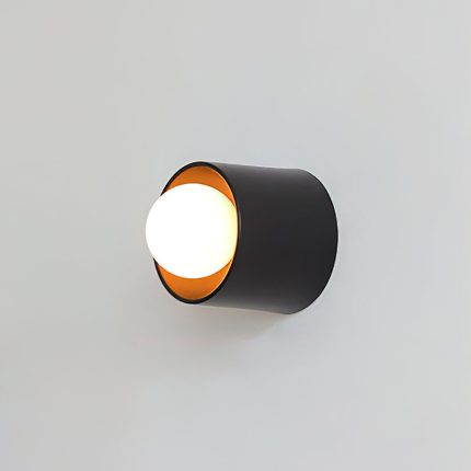
Cylora Tube Wall Sconce
Price range: $125.00 through $285.00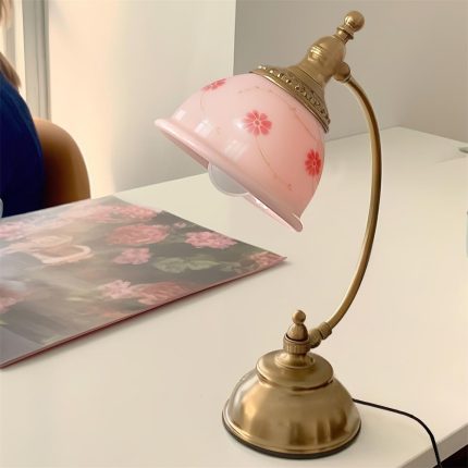
Mishya Floral Table Lamp
$174.00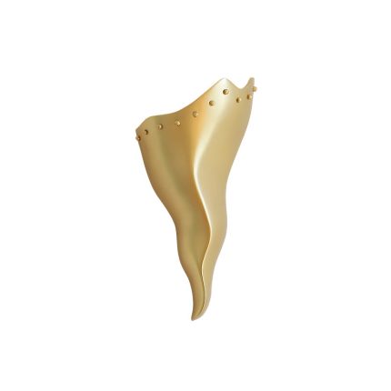
Valyra Wall Sconce
$225.00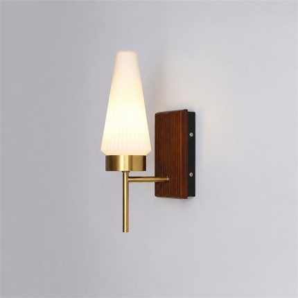
Taviren Wall Sconce
Original price was: $300.00.$154.00Current price is: $154.00.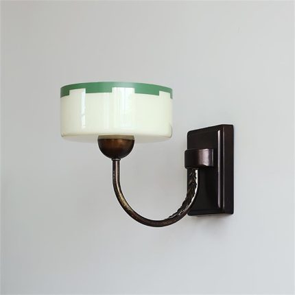
Elvaris Wall Sconce
Original price was: $300.00.$156.00Current price is: $156.00.
Reviews
There are no reviews yet.